Audiometer Evolution – Can Instruments Evolve?
Evolution can occur that has little effect on the outward appearance of the object. This involves operator interface features of an instrument rather than its inner workings. Does this apply to instruments used in audiology?
Traditional Audiometer Design – Mechanical Controls
Instruments are designed with means to control them; these include knobs, buttons, and other mechanical devices mounted on or near the instrument’s front panel. The designer has to lay out the panel in a way that accommodates all functions and modes of operation. In the case of a clinical audiometer, two different basic modes of operation must be accommodated: pure-tone thresholds and speech intelligibility tests.
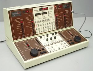
Figure 1. Beltone two-channel clinical audiometer circa 1970, dominated by push buttons.
Accommodating both modes tends to complicate the operator interface. Witness the interesting design attempts by companies like Beltone, 30 or 40 years ago. One of their crowning audiometer triumphs was equipped with an incredible number of buttons (Figure 1). The first task before the audiometer could be used was to learn the functions and locations of the individual buttons. Once this task was mastered, the accomplished professional could then show off this audiometer with pride, as it was so complex that only a genius would be capable of operating it. You know how to run that? Wow!
To further complicate the picture, different classes of users demanded different ways to lay out the control panel. Audiometric designers have been forced to choose a particular way to accommodate the wishes of a particular user class. Where to physically locate each of the different test channels? Right channel on the right side or right channel on the left side? And what to call each channel; right/left channels or channels 1 and 2? Or, set down a bunch of buttons to make the changes.
Once the design was complete, it was not scheduled for change. If, however, through the ANSI standards process or other influencing factor, the instrument had to allow for more or different tests, then the instrument designer needed to figure out a way to make his panel layout work with the new requirements. This accommodation can be easy, difficult, or impractical. If the latter is true, then it may be necessary to “go back to the drawing board” and design a replacement instrument. It is often difficult to bring on new instrument features with an old existing set of mechanical controls.
With a mechanical user interface, the design is frozen and difficult to change.
Enter the Computer
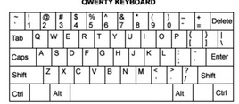
Figure 2. QWERTY (pronounced “kwerti” or “kwearti” is the most common keyboard layout for Latin script and comes from reading the first six keys on the top left letter row of the keyboard from left to right (Q,W,E,R,T,Y).
The first computers were “interesting” to try to use during their evolutionary process. The interface was through the familiar “QWERTY” keyboard* (Figure 2). Those who took on the first computers became rather good at typing. Program memory was often in the form of punched tape, or accessed by a reader, and “64k bytes was all that anyone could ever use.”
Rendering Computer Use Acceptable – The GUI
The real breakthrough in making the computer universally acceptable was the development of the Graphical User Interface, or “GUI.” The GUI could be laid out as a screen with a chosen number of controls and readouts in the form of graphs and numbers that fit the application at hand (Figure 3). This development was enhanced by the use of the mouse, which allowed the user to click on virtual screen objects to make things happen.
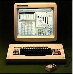
Figure 3. General GUI (Graphical User Interface) screen layout consisting of controls and readouts represented by numbers/graphs to fit the intended application, and accessed using a mouse.
The computer mouse and the GUI set the stage for the next step in evolution of instrumentation. By using a set of virtual controls appearing on the computer screen, it was now possible to change the interface as needed when going from one type of test to another. Now, the pure-tone program did not have all of the speech test controls hanging around to clutter things up. A cleaner control environment was immediately created.
A further advantage was that the controlling program could be updated by loading in a code software patch or a whole new program to the controlling computer. Sometimes the program had to be upgraded to remove annoying “bugs” present in the program that appeared in certain circumstances and stopped or destroyed test data.
Several manufacturers came out with computer-based audiometric instruments. Two that were nicely done were the Nicolet and one made in Portland, Oregon and based on the Apple computer. The Nicolet was the larger effort and had a very impressive Windows GUI. Both systems failed in the marketplace. The audiology community just did not embrace them. Why not? That question may be answered later in this post.
Enter the Touch Screen and Wireless Operation

Figure 4. Touch screen used within a hospital, eliminating the mouse.
The hospital environment was probably the biggest force to encourage the development of the touch screen computer. The touch screen eliminated the need for a mouse. Just a touch activated virtual controls (Figure 4). The user interface became simpler. The device could be easily cleaned.
A few years ago, Apple introduced the iPhone™ and then the iPad™. Both devices are touch controlled, and wireless as well. Then a company with the strange name of Google encouraged the development of the Android™ operating system running on a touch screen tablet. There are now many different versions and sizes of tablets available. These approaches have been successful in the marketplace.
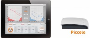
Figure 5. The Piccolo touch screen audiometer by Inventis, of Italy, using the iPad tablet.
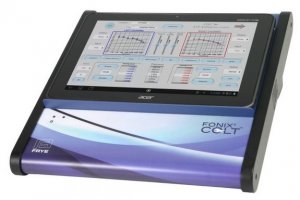
Figure 6. The Colt touch screen audiometer by Frye Electronics (U.S.), based on the Android tablet. The tablet is removable.
Three years ago, the Italian audiometric manufacturer Inventis showed the “Piccolo,” an audiometer that uses the Apple iPad for the user interface (Figure 5). Frye Electronics also introduced the “Colt” audiometer, which uses an Android tablet (Figure 6). Sales figures for the Piccolo are not known, but the company now shows a new iPad controlled “Cello” audiometer in their line.
The “Colt,” designed and introduced by Frye Electronics, was so-named to denote something new and frisky. The pure-tone screen tablet layout is shown in Figure 7. Controls are arranged in a pattern similar to Frye’s previous traditional audiometer, the popular FA10.
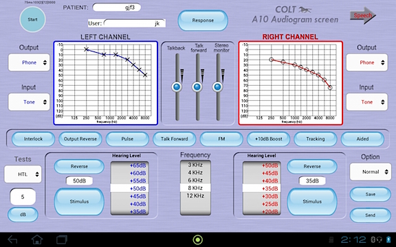
Figure 7. Pure-tone screen layout of the Colt touch screen audiometer.
Further Evolution?
Evolution occurs when a mutation endows the user with a new and more efficient way of doing things and thus has a better chance of survival in its environment. In nature, some assume that the evolutionary process is random, with mutations allowing certain species to survive while their neighbors do not. Does evolution really work that way? The writer doesn’t know. But, success breeds success. And we, as designers, can work to shape evolution to fit the user’s needs.
Does the Touch Screen Have a Future for Audiometers?
The audiologist, when performing an assessment, often needs to observe the patient while conducting tests. In such cases, the touch screen may not be the best vehicle. To use this approach, the audiologist’s attention must be removed from the patient to look at the touch screen tablet to be sure the proper control is activated. Touch controls have no tactile “feel.” But, with traditional and properly located knobs and buttons, the operator quickly learns where the controls are located and how to use them. Touch and feel are important in this application. The use of touch screens removes touch and feel. Divorcing tactile feedback from instrument operation is likely the reason for the demise of early computer-based systems. Does the touch screen belong in the future of audiology?
Instrumentation evolution is successful when the marketplace agrees that the new idea is worth keeping. The touch screen has certain real advantages. It provides the user with a simpler, less cluttered user interface. It allows changes in operator patterns; the user can choose to have the right hand controls work with the subject’s right ear, or visa versa. Speech sounds have been migrated into the tablet, making the use of recorded speech less of a chore. Test data can be saved to a file to be downloaded later at the user’s choice. The screen layout can be chosen to match the layout of a popular earlier design audiometer to avoid operator confusion. But, touch and feel are missing.
Touch and Feel Integration
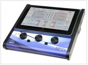
Figure 8. Recent audiometer evolution showing an audiometer that combines touch and feel, adding a tactile option (knobs and buttons) to facilitate testing.
The designers at Frye decided to bring back “touch and feel” to the Colt audiometer by adding tactile controls to the system. It is possible to use knobs and buttons while at the same time enjoying the values obtained by the use of a touch screen for all other functions. Knobs can be rotated to control frequency and amplitude; buttons can be pushed to present the stimulus. Actually, the choice is there for the professional to elect to use either tactile or touch controls for these functions (Figure 8).
So, the latest in audiometer evolution now uses a combination approach to a set of problems – touch and feel. If you like your knobs and buttons, you can keep your knobs and buttons. Really!
What Does the Future hold?
Will the touch only audiometer survive? Or, is the future more likely a combination of touch and tactile? Will there always be a spot for dinosaurs in the audiometric clinic?
We will see.
This article was originally posted on May 12 2015, by George Frye @ HearingHealthMatters.org and is reproduced with permission.

